THE BRIEF: Create a branding suite that feels calm, quietly sophisticated with a touch of modernity. The brand should reflect the business’s core elements—support individuals and families as they navigate transitions in to parenthood—and should have a feminine touch. The brand name itself was inspired by letting light in, as well as by the name Lucy, as it held personal meaning to the business owner, so incorporating those aspects would be a bonus.

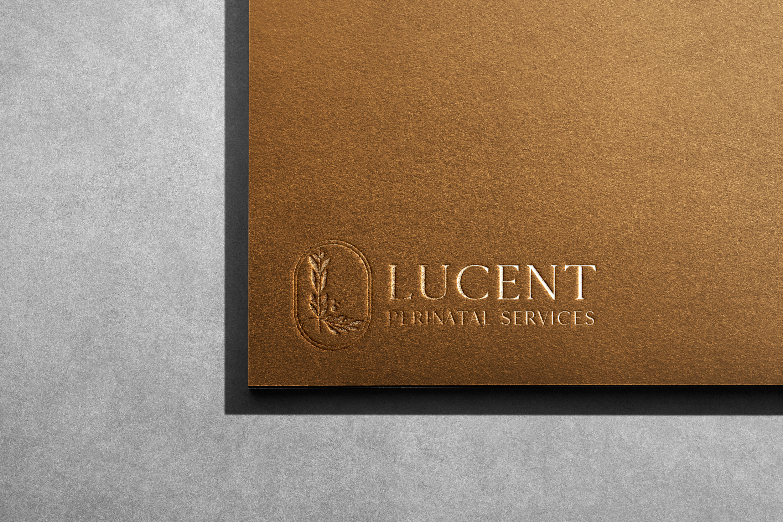
THE RESULT: Because there was so much symbolism in the business, we created a emblem that represented all of those elements. The leaves represent the growth that comes from therapy, and the shape the form is the letter L for the business name. The leaf shapes themselves subtly spell “LUCY” to tie in the personal touches for the founder. The three dots represent the family. These are all paired with a light, modern font and an earthy color palette.