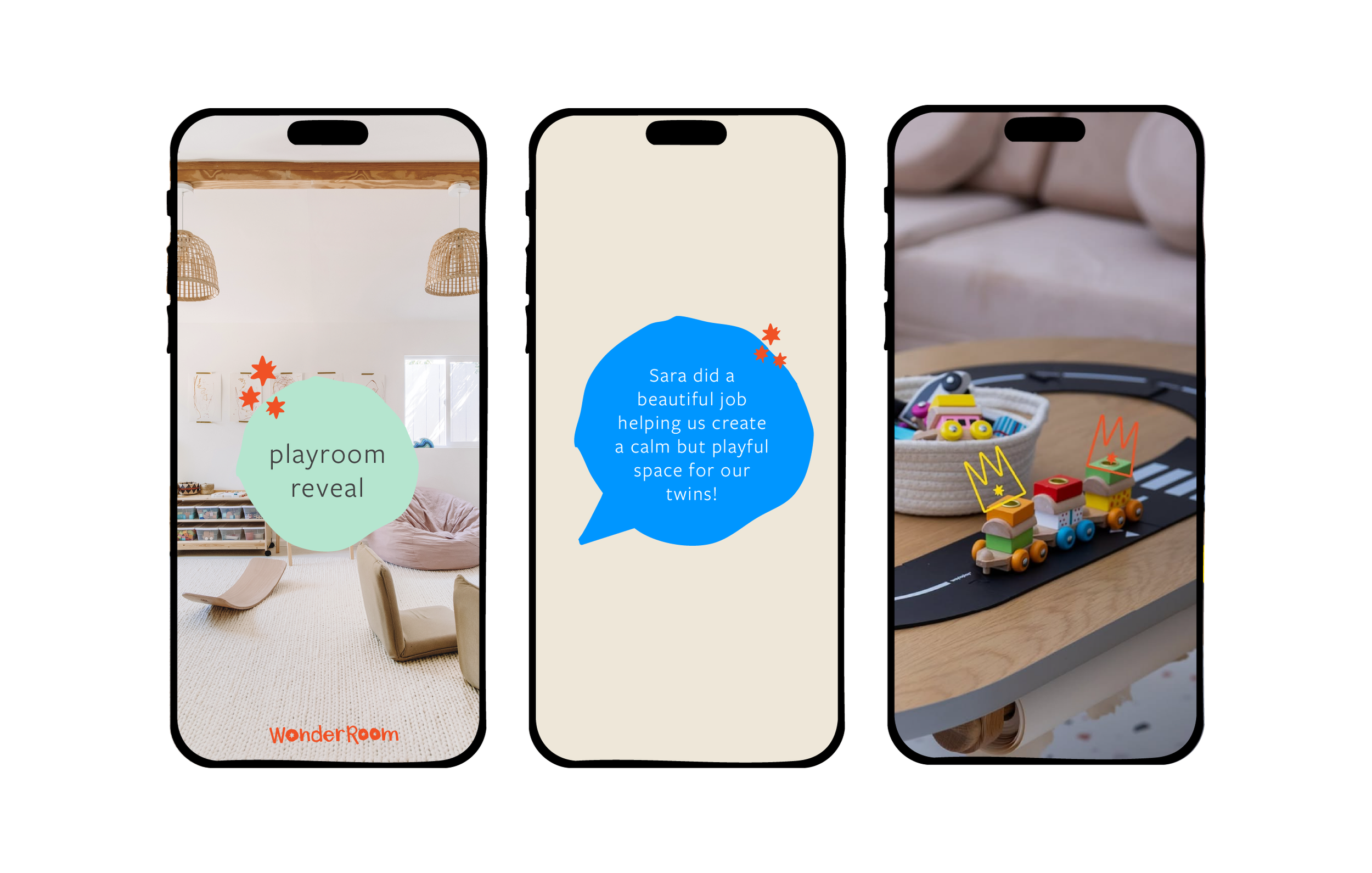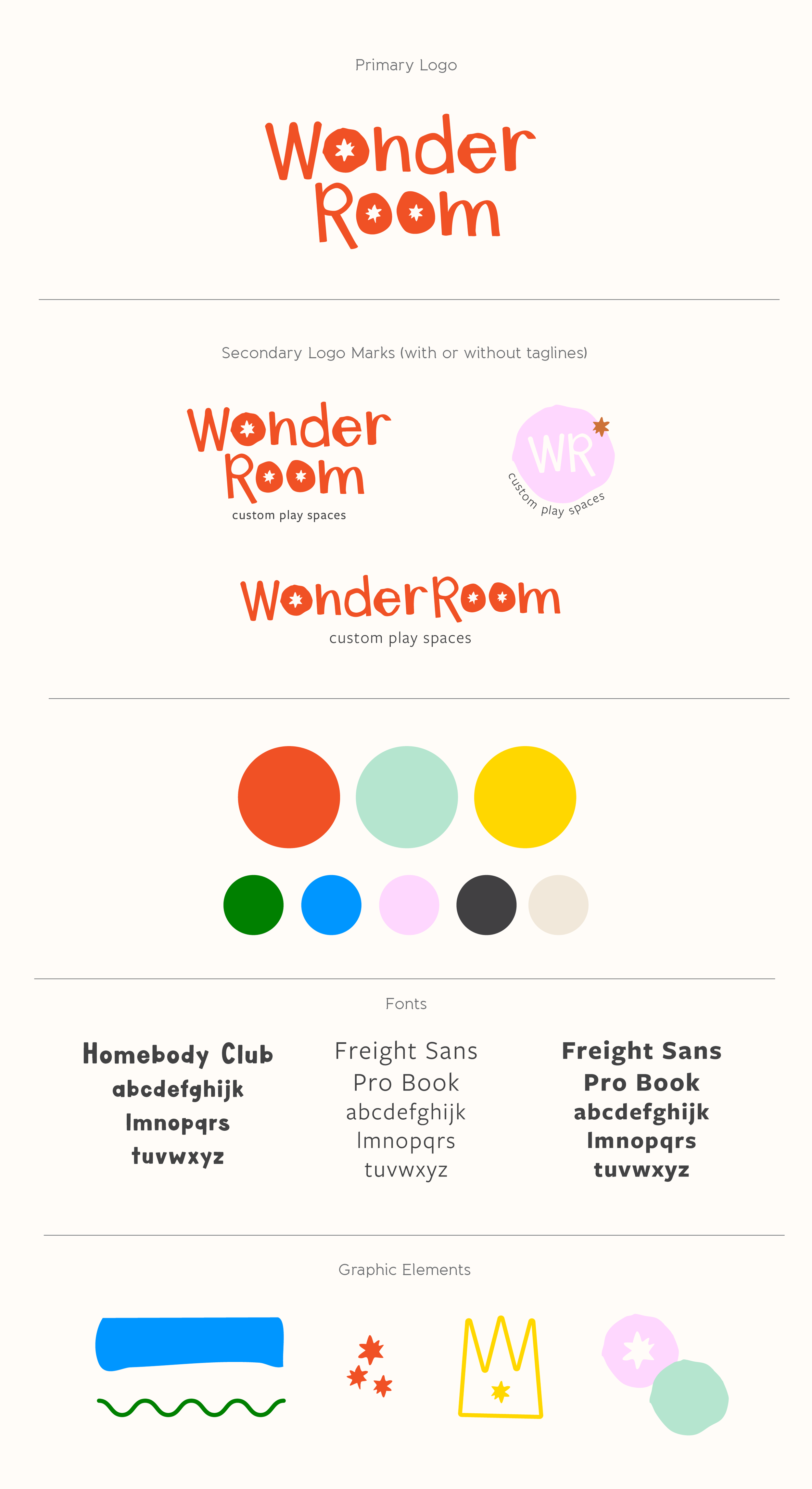
THE BRIEF: Create a branding suite that is playful and fun, child-like without being childish and includes many custom elements to incorporate into her social media presence as a designer of custom play spaces and with a flexibility to grow her business.
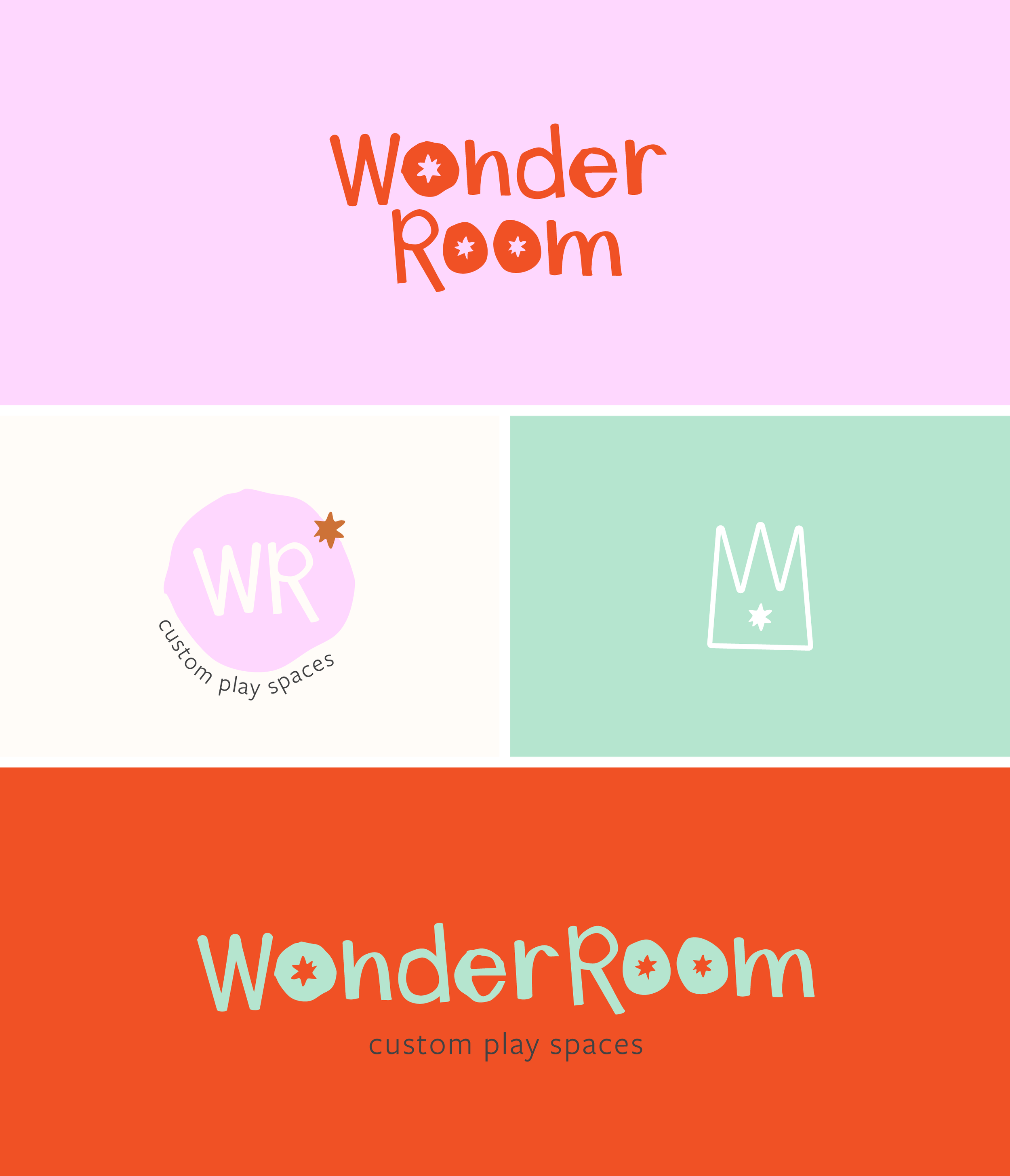
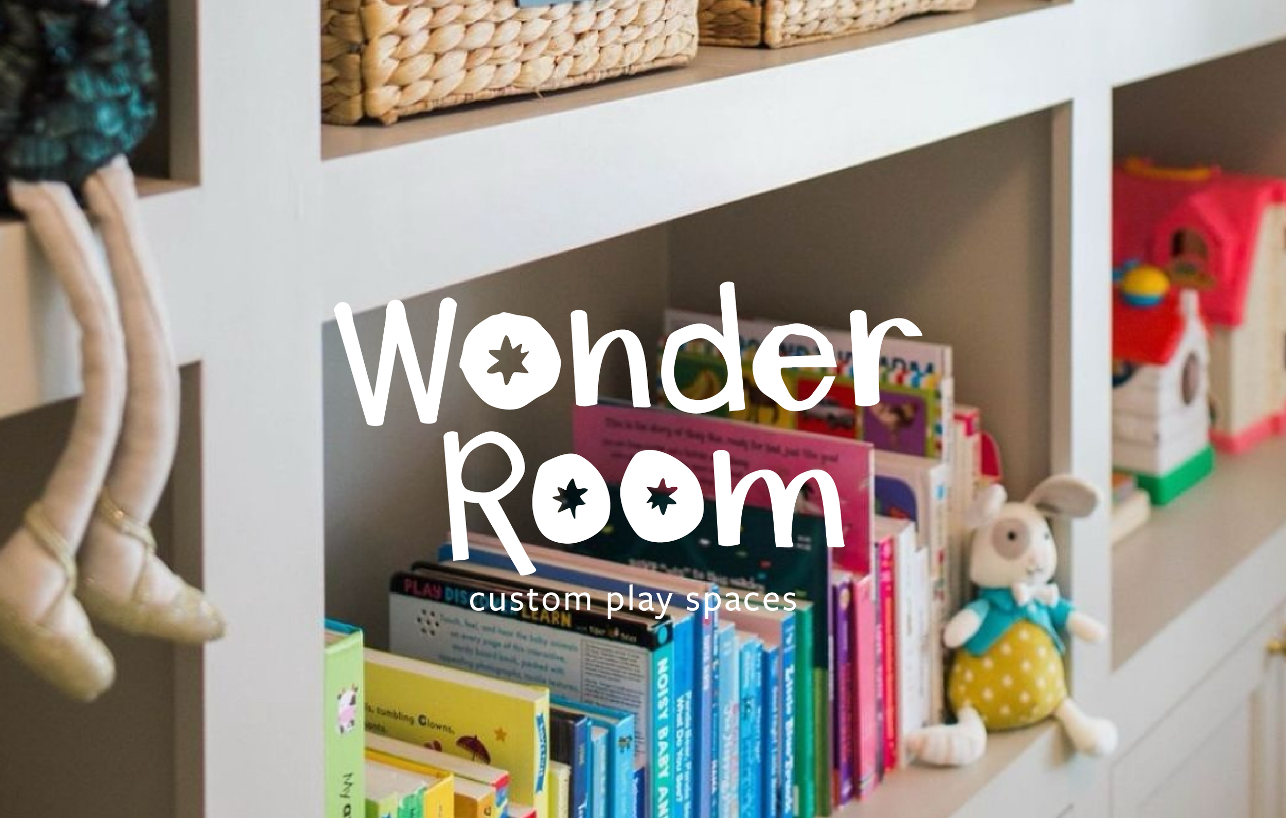
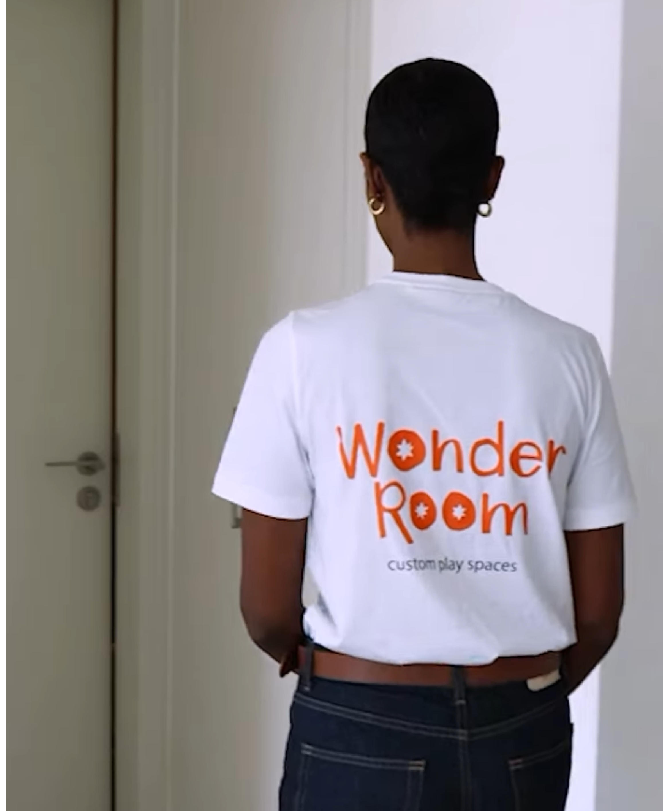
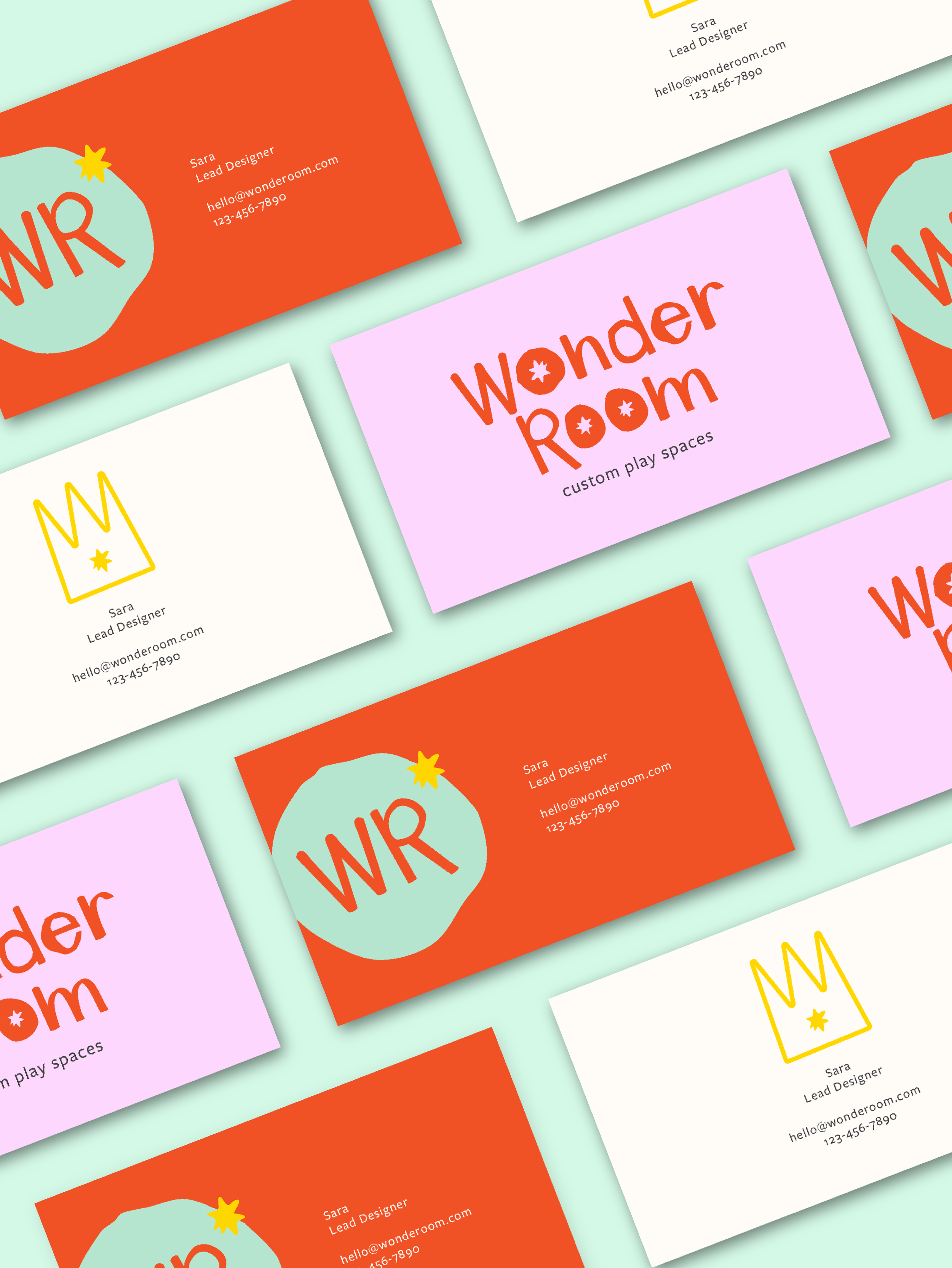
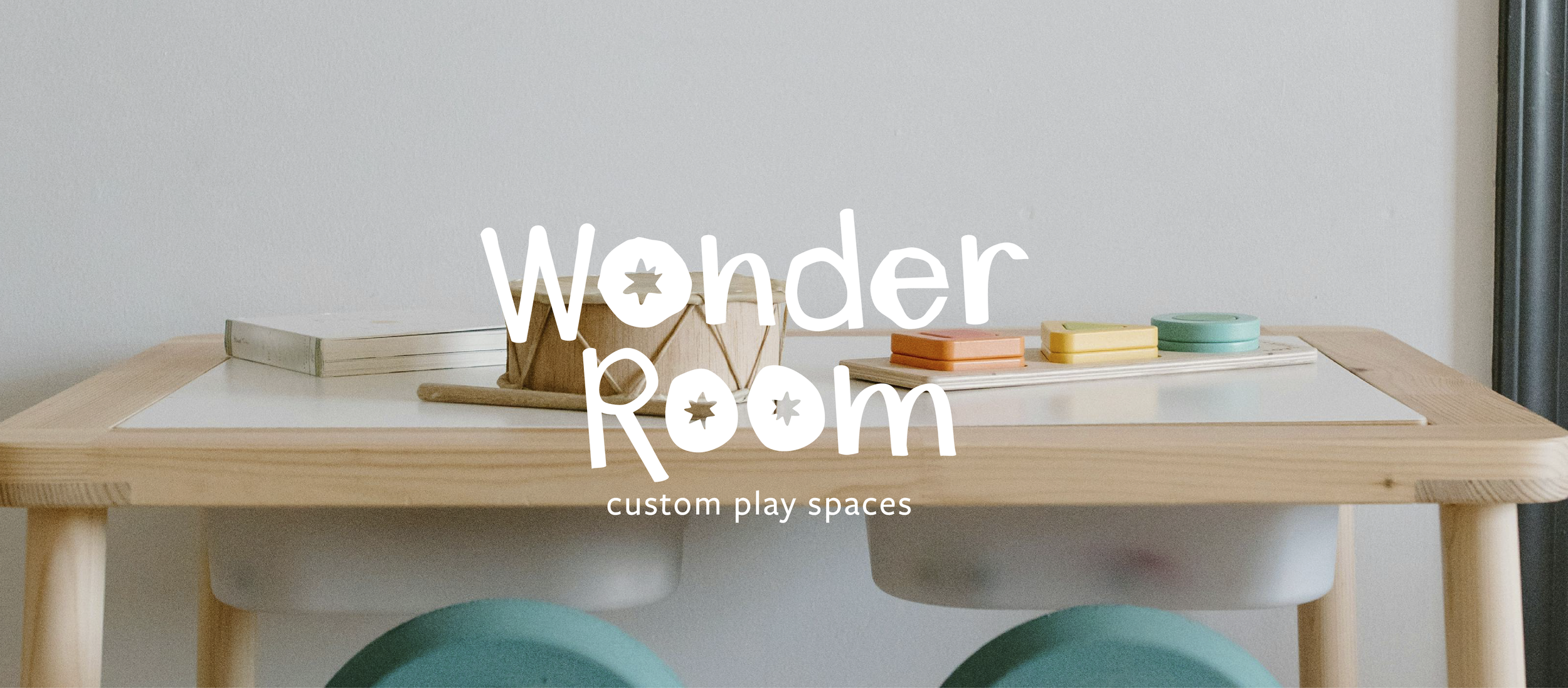
THE RESULT: Ultimately, Sara fell in love with a design that incorporated hand-drawn circles for the O’s (hand-drawn by my own kids!), with organic shapes, squiggles and stars. Inspired by the wonder in her name and the wonder that is play, we created a crown shape that also incorporates the W from Wonder as an emblem she could use throughout her branding.